“Call-to-Action Buttons In Website Engagement” Unlocking the Key to User Interaction and Conversion. In today’s digital sphere, where user engagement reigns supreme, call-to-action (CTA) buttons have emerged as the quintessential tool for guiding online visitors toward desired actions.
From sparking curiosity to driving conversions, these small yet powerful elements hold the potential to transform passive browsers into active participants.
This article will explore the art and science behind crafting effective CTAs, exploring their role in fostering meaningful interactions and enhancing website performance.
Consider CTA buttons as the lighthouses amidst the vast ocean of content, guiding ships (aka users) to their desired destinations.
Every successful website knows this, and it’s why they place such high importance on the design, text, and placement of their CTAs. It’s a delicate balance between inviting and commanding, guiding and taking control.
Having worked with various websites and campaigns, I’ve seen firsthand the colossal impact of well-crafted CTAs on conversion rates and overall user engagement.
In my journey with digital marketing and web design, I’ve enjoyed the eureka moments when a CTA button I’ve implemented has performed spectacularly.
From tweaking the color palette to testing out different action verbs, each change has brought us one step closer to mastering the art of the call to action.
This article will cover real-world experiences, the dos and don’ts, and a behind-the-scenes look at crafting CTAs that truly enchant and convert.
Let’s focus on the artistry and strategy behind designing effective CTAs. In the following section, I’ll share my success stories where aesthetics met analytics, leading to notable enhancements in website performance.
Let’s unveil the factors that can turn a standard button into a magnet for clicks—a blend of style, position, and psychology.

Designing CTAs for Success: Personal Anecdotes of Aesthetic and Functional Triumphs
I will walk you through a time when design choices transformed my website’s user engagement. After a site overhaul, I realized that the right hues and shapes matter.
My choice to move from a generic grey button to a vibrant orange one led to a surprising uplift in click-through rates. This isn’t just about choosing my favorite color; it’s about understanding color psychology and how certain shades can trigger action.
If you’re curious about the placement of CTAs, you’ll also find out. Once, after moving a subscription CTA above the fold, its visibility skyrocketed—as did the signups.
This strategic move was backed by plenty of trial and error, and today, I stand by the strategy of placing key CTAs where eyes naturally gravitate first.
I’ll share some compelling numbers to support my narrative. For instance, after redesigning the ‘Add to Cart’ button, the conversion rate increased by over 20%. Design tweaks went beyond color and placement.
The shape and size were also adjusted, leading to a more accessible and more pleasant user experience. This isn’t mere conjecture; it’s drawing on the principles of human-computer interaction to create a seamless user journey.
You can constantly adjust your approach, but choose something that resonates with your users. On my journey, hover animations were integrated, which spiked engagement due to their interactive nature.
Users loved the immediate feedback from their actions, confirming that even the most minor design changes can make a significant difference.
Words That Encourage Clicks: Crafting Text for CTAs with a Personal Touch
I will share some insights on word choice in crafting call-to-action (CTA) buttons that I found incredibly compelling. There’s a little magic in the way you word your CTAs.
In my experience, it’s not just about telling people what to do; it’s about making the offer irresistible. The question isn’t ‘Do you want to click this?’ but more, ‘Can you afford not to click this?’
Here’s a quick story: I once revised the text on a CTA from ‘Download Guide’ to ‘Get My Free Guide Now!’ The result? A noticeable uptick in clicks.
This taught me the power of personalization—using ‘My’ instead of a generic call and adding ‘Now’ to inject immediacy.
You’ll find out that balancing informative and overwhelming content is crucial. I learned early on that my CTAs shouldn’t read like a user manual.
Instead, I struck a balance with concise, action-packed phrases that tell visitors exactly what to expect while sparking curiosity. For example, switching a bland ‘Submit’ to ‘Show Me How’ instantly changed the game.
What’s the significance of tone and voice? Everything. It reflects your brand. I’ve made CTAs sound like a helping hand, not a command.
Phrases like ‘Start Your Adventure’ or ‘Let’s Uncover More’ transformed the user experience from transactional to personal, and I like to leverage that strategy.
The following section will examine how I created a sense of urgency and offered incentives through CTAs. This isn’t just about getting a click; it’s also about providing value that propels the user to act—and act now.
Sealing the Deal with CTAs: My Journey with Creating Urgency and Offering Incentives
I learned there’s a subtle art to making someone feel like they shouldn’t wait another minute. When it comes to CTAs, creating a sense of urgency can dramatically steer the interaction toward a conversion.
My dabbling with phrases like ‘Limited time offer’ and ‘While supplies last’ often led to a noticeable click uptick. Timing here is essential; overuse can lead to fatigue and skepticism, but just the right amount teases out that impulse to act now.
Offering incentives might be one of the oldest tricks in the book, but believe me, it’s also one of the most effective. I remember launching a campaign that offered a free ebook download with any signup. The response rate soared, and this wasn’t by chance.

People are motivated by the prospect of getting something valuable in return for their actions. There I was, witnessing my CTAs transform from mere buttons to gateways of mutual benefit.
Having a juicy incentive is one thing, but pair that with a crystal-clear value proposition, and you’re on a different level.
From my experiments, I’ve realized that your audience needs to instantly grasp the question, ‘What’s in it for me?’.
Every successful CTA of mine has had two things: a promise and an immediately apparent payoff. That will include straightforward language and an obvious upside that aligns with user desires.
Analyzing Impact and Tweaking CTAs: A Continuous Cycle of Personal Learning and Improvement
After implementing the CTAs, which were deliberate creations of good design, careful wording, and crafting a sense of urgency, I thought my job was done.
But guess what? It was only the beginning. Monitoring the performance of those CTAs was the next critical step, turning good results into great ones over time.
I will share some personal reflections on why analyzing and tweaking your CTA strategy is like fine-tuning an already-purring engine—it just improves.
Take my experience with A/B testing. At first, it felt like shooting darts in the dark—guessing what might boost CTA performance. But then, it turned into a structured approach rooted in accurate data.
I’ve had my fair share of surprises during A/B tests: what I assumed would fail sometimes succeeded, and vice versa. That’s where the fun lies.
You’ll learn about the value of being open-minded and the thrill of unexpected victories.
But it’s not all about the successes. The misses are just as valuable, and I’ve learned to love the process. Your first attempt doesn’t need to be your last.
It shouldn’t be. Each iteration teaches you something new about your audience and your approach. I tweaked copy, modified designs, and shifted placements—all while keeping a keen eye on user engagement metrics. These continuous improvements led to consistently better outcomes.
Building a feedback loop into your CTA strategy is also essential. I’ve learned directly from users what worked and what didn’t—their insights are priceless.
Sometimes, changes based on feedback make all the difference. It’s not just about adjusting your CTAs but evolving them to resonate even more deeply with your audience. And that genuinely excites me.
Ultimately, the key takeaway from this journey is the undeniable power of iteration. Even when you hit a sweet spot with your CTAs, the landscape of user interaction is constantly changing.
Staying agile and receptive to change offers many opportunities. From my experience, the CTAs that remain effective are the ones that evolve.
This is not just a set-it-and-forget-it task. It’s an ongoing relationship with your audience; your attention to detail will reflect your engagement rates.
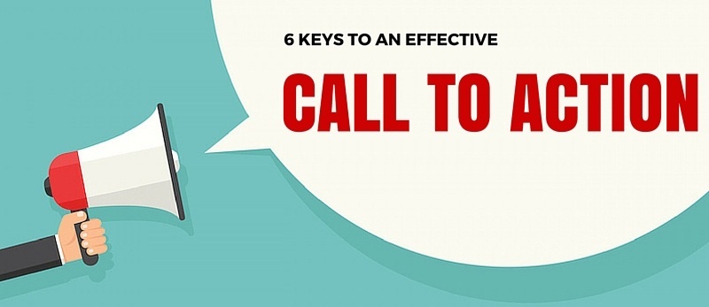
Here are six essential tips to follow when creating call-to-action (CTA) buttons:
- Clear and Concise Text: Keep your CTA button text clear, concise, and action-oriented. Use strong verbs that prompt users to take immediate action, such as “Buy Now,” “Sign Up,” or “Learn More.”
- Contrasting Colors: Make sure your CTA button stands out on the page by using contrasting colors that catch the user’s eye. Choose colors that complement your overall design but still create a visual emphasis on the button.
- Placement: To maximize effectiveness, position your CTA button strategically on the page where it’s easily noticeable and accessible to users. Consider placing it above the fold (visible without scrolling) and near relevant content.
- Mobile Optimization: As more users access websites from mobile devices, optimizing your CTA buttons for mobile responsiveness is essential. Ensure they are large enough to tap easily on smaller screens and that the text remains readable.
- Create Urgency: Incorporate language or design elements that create a sense of urgency, encouraging users to act quickly. Phrases like “Limited Time Offer” or “Act Now” can motivate users to take immediate action rather than procrastinate.
- A/B Testing: Continuously test different variations of your CTA buttons to identify which resonates best with your audience. Experiment with other colors, text, placement, and design elements to optimize for higher conversion rates.
In Conclusion
In exploring the intricate world of call-to-action (CTA) buttons, we’ve uncovered these small yet mighty elements’ pivotal role in guiding online visitors toward meaningful interactions and conversions.
Like lighthouses amidst the vast ocean of content, CTAs serve as beacons, steering users toward their desired destinations in the digital domain.
Reflecting on personal experiences and industry insights, we’ve scrutinized the delicate balance between aesthetics and functionality, probing into the artistry and strategy behind crafting effective CTAs.
From design choices that led to remarkable uplifts in engagement to the nuances of word selection that trigger action, each aspect contributes to the success of these interactive elements.
But our journey doesn’t end here; it’s merely the beginning. As we embrace the iterative nature of digital marketing, we invite you, our readers, to join us in this ongoing conversation.
Your insights, experiences, and questions are invaluable in shaping the evolution of CTA strategies.
- Have you encountered a CTA that compelled you to click?
- Or perhaps you have insights to share from your experimentation with CTAs?
We’d love to hear from you. Please leave your comments below, and let’s continue exploring the ever-evolving realm of website engagement together. After all, every click tells a story in the digital interaction domain, and your voice shapes its narrative.
Earl
HI Earl,
Great post! The analogy of CTAs as “lighthouses amidst the vast ocean of content” is particularly evocative and underscores their guiding role in user navigation and conversion. I enjoyed your personal anecdotes which made your information more actionable.
I’m particularly intrigued by your approach to creating a sense of urgency without overwhelming users. This balance is crucial yet challenging to master. Could you delve deeper into how you determine the right amount of urgency for different types of CTAs? Specifically, how do you avoid the pitfall of user fatigue while maintaining a compelling call to action?
Thanks!
Scott
First, thank you for your comment and for finding the post extraordinary.
To answer your question: To avoid user fatigue while keeping CTAs compelling, keep them clear and relevant, space them out strategically, vary the format, highlight benefits, use appealing designs, and test different versions. Integrate CTAs smoothly into the user experience.