Landing pages are the cornerstone of any effective digital marketing strategy, serving as the entry point for potential customers into your sales funnel. Optimizing landing pages for higher conversion rates is crucial to maximizing conversions and achieving your business objectives. Here’s a breakdown of the key elements involved:
Significance of Landing Pages: Landing pages are designed with a specific goal, whether generating leads, making sales, or driving traffic. They provide a focused and tailored experience for visitors, directing them towards taking a desired action. A well-optimized landing page can significantly improve campaign performance and return on investment (ROI).
Conversion Rates Defined: Conversion rates measure the percentage of visitors who complete a desired action on your landing page, such as purchasing or signing up for a newsletter.
Understanding conversion rates is essential for gauging the effectiveness of your landing page and marketing efforts. Improving conversion rates leads to more efficient use of advertising budgets and higher revenue potential.
The interplay between User Experience and Conversion Rates: User experience (UX) determines how visitors engage with your landing page. A seamless and intuitive UX can increase trust, reduce bounce rates, and lead to higher conversion rates.
Elements such as page layout, navigation, loading speed, and call-to-action (CTA) placement all impact the user’s journey and decision-making process. Continual testing and optimization of UX elements are essential for maintaining high conversion rates and adapting to evolving user preferences and behaviors.

Analyzing Your Current Performance
Analyzing the performance of your landing pages is essential for identifying strengths, weaknesses, and opportunities for improvement. Here’s how you can effectively evaluate your landing page effectiveness using analytics:
Using Analytics to Assess Landing Page Effectiveness: Utilize web analytics tools such as Google Analytics to track metrics like traffic, bounce rate, average session duration, and conversion rate. Monitor user behavior, including where visitors are coming from, which pages they land on, and how they navigate your site. Identify patterns and trends in visitor interactions to gain insights into what elements of your landing page work well and what areas need optimization.
Identifying Key Performance Indicators (KPIs) for Conversion: Define clear KPIs that align with your business goals, such as conversion rate, lead generation, or revenue generated. Track KPIs over time to measure the effectiveness of your landing pages and marketing campaigns. Segment data based on different traffic sources, demographics, or devices to identify specific areas for improvement.
Learning from User Feedback and Behavior Tracking: Gather qualitative feedback through surveys, polls, or user testing to understand user perceptions and preferences. Analyze heatmaps, click-through rates, and scroll depth to visualize how users interact with your landing page and identify potential usability issues.
Please pay attention to exit points and abandoned forms to pinpoint barriers to conversion and address them accordingly.
Designing for Conversion: Best Practices
When designing landing pages that convert, paying attention to critical design elements can make all the difference. Here are some best practices to follow:
The Impact of Visual Hierarchy and Layout on User Decisions: Arrange elements on your landing page to guide the user’s attention to place the CTAs strategically throughout the page, ensuring they are visible without directing the user’s attention to intrusive.
The most critical information. Utilize visual hierarchy by emphasizing headlines, images, and CTAs to make them stand out. Keep the layout clean and uncluttered to avoid overwhelming the visitor and maintain focus on the primary message.
Compelling Calls-to-Action (CTAs) Design CTAs that are clear, concise, and action-oriented, using persuasive language to prompt users to take the desired action.
Using contrasting colors and bold fonts makes CTAs visually distinct and easy to spot. Place CTAs strategically throughout the page, ensuring they are visible without guiding the user’s attention to intrusive to guide the user’s attention to intrusive.
The Importance of Having a Mobile-Responsive Design: With the increasing use of mobile devices, it is crucial to ensure your landing page is optimized for smaller screens.
Adopt a responsive design approach that adjusts layout and content dynamically based on the user’s device. Test your landing page across various devices and screen sizes to ensure a seamless user experience for all visitors.
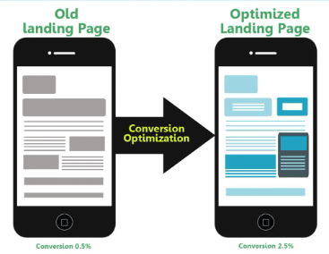
A/B Testing: Comparing Design Elements and Measuring Impact: Conduct A/B tests to compare design elements such as colors, layouts, imagery, and CTAs. Set clear hypotheses and metrics to measure the impact of design changes on conversion rates. Iterate and refine your design based on test results to improve performance continually.
The Role of Content in Conversion
Compelling content is the heart of any successful landing page, influencing visitors to take action and ultimately convert. Here’s how you can leverage content effectively:

Creating Engaging Headlines and Persuasive Copy: Craft attention-grabbing headlines that communicate your offer’s unique value proposition.
Use persuasive copywriting techniques to highlight benefits, address pain points, and compel visitors to explore further. Incorporate storytelling elements to evoke emotion and create a connection with your audience.
Utilizing Social Proof and Testimonials Effectively: Showcase social proof, such as customer reviews, ratings, and testimonials, to build trust and credibility. Highlight real-life success stories and case studies that demonstrate the positive outcomes of your product or service.
Incorporate user-generated content, such as photos or videos, to provide authentic validation of your offering.
Balancing Informative Content with Succinctness to Maintain Engagement: Provide essential information about your product or service clearly and concisely. Use bullet points, numbered lists, and visual elements to break up content and improve readability.
Avoid overwhelming visitors with too much information; focus on delivering the most relevant details that address their needs and motivations.
Advanced Optimization Techniques
Taking your landing page optimization to the next level involves implementing advanced techniques that capitalize on psychology, technology, and search engine optimization. Here’s how you can elevate your strategies:
Implementing Psychological Triggers to Boost Conversions: To influence visitor behavior, utilize psychological principles such as scarcity, urgency, social proof, and reciprocity. Incorporate scarcity tactics like limited-time offers or low-stock alerts to create a sense of urgency and drive action.
Use social proof elements such as customer testimonials, endorsements, and user-generated content to build trust and credibility.
Leveraging Technology: Chatbots, Personalized Experience, and Dynamic Content: Integrate chatbots to provide real-time assistance and personalized recommendations based on user interactions. Deliver personalized experiences by dynamically adjusting content, imagery, and offers based on visitor demographics, behavior, and preferences.
Implement dynamic content such as countdown timers, location-based offers, or product recommendations to enhance engagement and relevance.
You are optimizing Landing Pages for Search Engines to Increase Organic Traffic. Use keyword research to identify relevant search terms and incorporate them strategically into your landing page content, headings, and metadata.
Optimize on-page elements such as title tags, meta descriptions, and image alt text to improve search engine visibility and click-through rates. Ensure your landing pages load quickly, are mobile-friendly, and have high-quality, relevant content to enhance user experience and satisfy search engine algorithms.
Case Study: Optimizing Landing Pages For Higher Conversion Rates
In my previous role at a tech startup, I worked on optimizing the landing page for a product launch. Our goal was to increase conversions and drive more sign-ups for our subscription-based service, and we employed these strategies to accomplish that objective.
- Identifying Pain Points: We began by analyzing user behavior and feedback to identify pain points on the existing landing page. Through heatmaps and user recordings, we discovered that visitors were dropping off before completing the sign-up process, indicating potential friction points.
- Iterative Testing: We adopted an iterative approach to testing, starting with small changes and gradually scaling based on results. One of the initial changes we made was to simplify the sign-up form by reducing the required fields. This led to a noticeable increase in sign-up conversions, confirming the importance of reducing friction.
- Compelling Visuals and Messaging: We revamped the landing page design to make it more visually appealing and aligned with our brand identity. We incorporated high-quality images and clear, concise messaging highlighting our service’s key benefits. This helped to capture visitors’ attention and convey the value proposition more effectively.
- Social Proof and Trust Signals: We added customer testimonials and trust badges from industry partners to the landing page to build trust and credibility. This reassured potential customers and addressed any concerns they may have had about the reliability of our service.
- Mobile Optimization: Recognizing the growing importance of mobile users, we ensured that the landing page was fully optimized for mobile devices. This involved testing the page on various screen sizes and optimizing load times to provide a seamless experience for mobile users.
- Continuous Optimization: We didn’t stop after the initial improvements. Instead, we continued to monitor performance metrics and conduct A/B tests to refine the landing page further. By experimenting with different variations of elements, such as CTAs, headlines, and imagery, we could identify what resonated most with our target audience.

As a result of these efforts, we saw a significant increase in conversion rates on the landing page, with sign-ups surpassing our initial projections. This success drove growth for our business and demonstrated the power of data-driven optimization in achieving tangible results.
Wealthy Affiliate has been instrumental in helping me optimize my landing pages for higher conversion rates. Through their comprehensive training resources, I’ve learned the essential techniques and strategies to craft compelling landing pages that engage visitors and drive them toward desired actions.
Wealthy Affiliate’s step-by-step tutorials, live webinars, and interactive discussions have deepened my understanding of user behavior, design principles, persuasive copywriting, and effective call-to-action strategies.
Additionally, the supportive community within Wealthy Affiliate has offered valuable feedback and insights, allowing me to iterate and refine my landing pages for optimal performance. Thanks to Wealthy Affiliate, I’ve significantly increased my conversion rates and achieved greater success in my online marketing endeavors.
Video
Conclusion
Landing pages are not just another webpage; they are the digital handshake that introduces your brand to potential customers. As you’ve seen throughout this article, optimizing these landing pages is crucial and multifaceted.
From understanding their significance to implementing advanced optimization techniques, every step is essential in maximizing conversions and achieving your business objectives.
But our journey doesn’t end here; it’s just the beginning. We’ve delved into the intricacies of creating engaging headlines, persuasive copy, and compelling calls to action.
We’ve explored the significance of user experience and its role in the call to action in conversion rates. We’ve even ventured into the realm of advanced optimization techniques, leveraging psychology, technology, and SEO to take your landing pages to new heights.
Now, it’s your turn. I encourage you to apply these insights to your landing pages and share your experiences in the comments below.
- Have you tried implementing psychological triggers?
- How did it impact your conversion rates?
- What about A/B testing?
- Did you uncover any surprising results?
Your feedback and stories can enrich our community and help us learn and grow together.
So, let’s continue this conversation. Share your thoughts, ask questions, and let’s embark on this optimization journey together. After all, in the dynamic world of digital marketing, there’s always something new to discover and explore.
Earl
